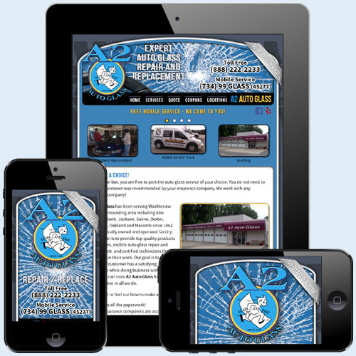
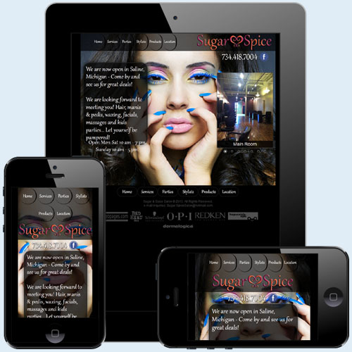
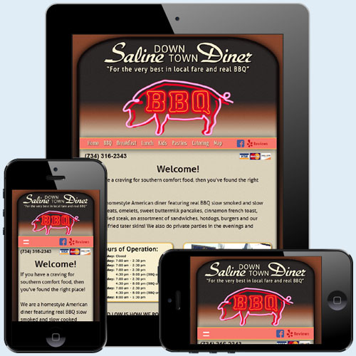
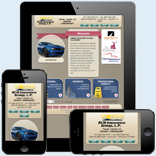
We design web sites that look good on any device. We accomplish this by using a responsive grid framework as the base of all our designs. We then modify and style the website for each device profile within the framework (Desktop/Tablet Landscape, Tablet Portrait, Phone Landscape and Phone Portrait). The framework automatically detects the screen size of the device viewing it and displays the appropriate version accordingly.
You can see this in action by resizing your browser window on this web site, or try it on one of our other responsive designs:
A2 Auto Glass
Sugar & Spice Salon
Saline Downtown Diner
RLM Insurance Group
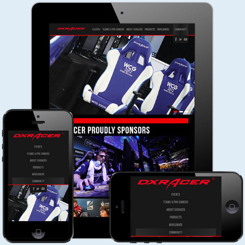
DX Racer


